Yesterday I started on showing off this month’s t-shirt designs, and boy there are a few this month. I would normally put t-shirt designs at the end of the month, but in this case, I’m actually getting these shirts in time to wear them for this semester… which is also the same time any of my peers might want to see them.
Sonic The Hedgehog logos are really quite good. It’s a standardised font, it’s a standardised formatting, and the rest of the logo is done with individual specific details for the media in question, like Mania’s springs and whorls. This was really, really easy to make and it looks great.
I think sometimes it’s easy to fail to appreciate just how good the branding is for Sonic.
Also, there’s a version of this with ‘& Knuckles’ on it, but it honestly doesn’t look as good and means the joke ends on a second punchline, and that sucks.
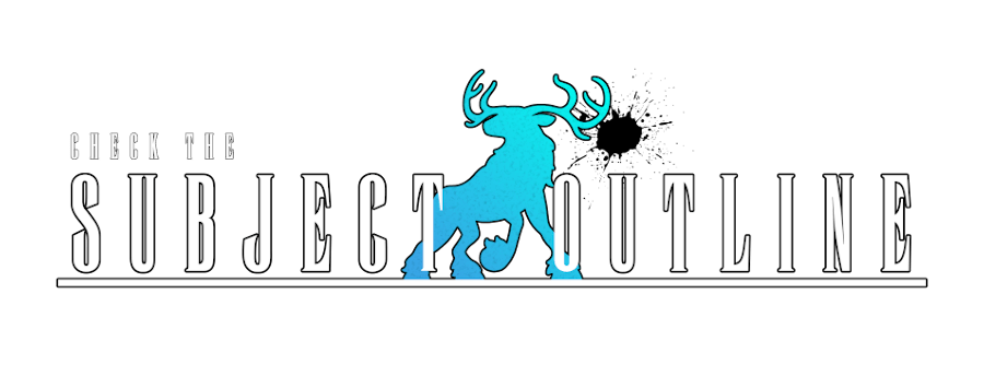
This was based on the suggestion of my dear friend Shelf, who pointed out that while yes, it looked like a Final Fantasy logo to start with, I needed something crystalline in the middle. Fox also pointed out that it’s where a splash of colour happens. In this case, it’s a silhouette of an elk.
Because elks are cool.
The elk is a gradient that then got ran through a cubism filter to make it look kinda crystall-y.
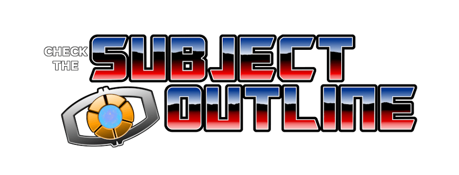
Speaking of that cubism filter, get a load of that crystal in my extremely home-made leadership matrix. The matrix is entirely out of gradients otherwise.
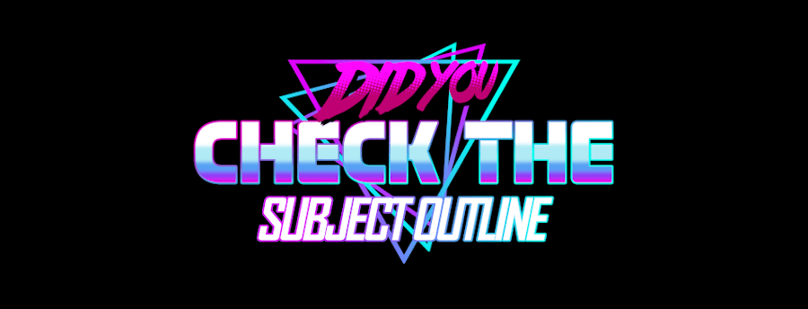
The text is really interesting because my memory of the gradient on this is really vibrant – a really rich red, a really deep blue. But if you go back and look at the G1 logo for Transformers, it’s… positively understated.
This gradient is made up, in order from the top of the image to the bottom, a gradient of blue-to-white; a line of garbage hand-drawn then smoothed and smudged to look a bit more like a mountain range; a gradient of red to white. The bottom of the garbage line gets blurred into the red-white gradient, and that’s how I got that effect.
I’m really proud of all these things that don’t require me to like, do much drawing vs making my designs with shapes, rotations and symmetries. There’s a lot of that here.
And finally…
God damn.
I wanted to make a shirt with the design from the Vaporwave Designer meme program. But the thing is, that’s not only not at a proper resolution for shirts, but it’s also really busy for a design when I can’t control all the elements of the shirt. I can’t cover the entirety of the shirt, to give it the proper background. I can’t do gradients either – less-than-full opacity, when printed on a shirt, is printed on white and creates a nasty white silhouette.
With those limits, instead of duplicating that style, I wanted to make something that evoked it, in colours I like. And thus, we get this hodge-podge of ‘wow, look at all the effects I can do.’
If you’d like to check these shirts out, maybe buy a sticker or a shirt… well, check it out here.