Hey, you know how I talk about flags?
You don’t?
God, it’s hard to have a coherent, clear brand. Anyway, yeah, I talk about flags? Sometimes? But when I do talk about them I tend to talk about them a lot because people are really bad at making good flags, even though ‘good flags’ is a category that’s super easy to work on. Anyway, there are a bunch of pride flags, and I’ve worked with them – you may remember my Captain America Pride Shields, for example.
Pride flags are a weird category to talk about because first, they’re building off common language to one another, and also, because the most common pride flag categories are… good? They’re really good. Pride flags are largely made by people, it seems, who know how to make flags. There are bad pride flags – like the Labrys Lesbian flag, or the Bear flag – but for the most part, these flags are really good.
Here then are Five Pride-or-Pride-Adjacent-Flags that are good, and why they’re good!

The classic pride flag – which isn’t the earliest version of it, and it isn’t the most recent – is a flag that’s an example of how you can lean on the ‘rules’ of flags if your flag is holding together some other way. As it stands, this is a six colour flag, and I normally prefer flags to cap out at five colours. What’s more, of those colours, they’re presented next to lower-contrast colours – the blue next to the purple, the orange next to the red and yellow.
Still, the imagery is a rainbow, which is a spectrum and is a part of the natural world, and Christians get real mad when you imply they don’t have exclusive ownership over rainbow imagery. This is a great flag, particularly because as a rainbow, it represents an infinite spectrum of many different related things. It’s a great ‘coverall’ flag for everyone in this space of queerness.
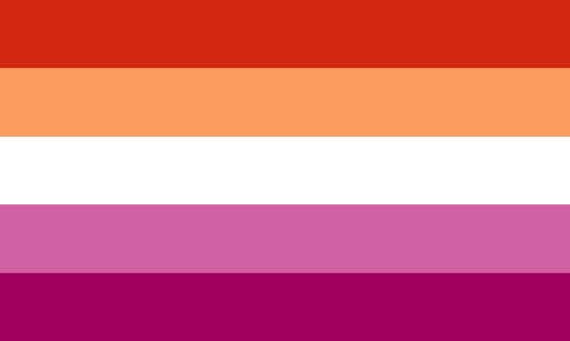
This flag, a permutation on the Lipstick Lesbian flag, was devised by Emily Gwen in 2018. I like it a lot, particularly the way that it borrows from the trans flag (more on that later) with its white strip in the centre. The original lipstick lesbian design was just pinks and magentas, but this one adds orange – a colour that is related to the redder pinks and magentas, but is also crucially not the obvious signifier colour of blue (which we commonly use to signify boys).
In this way, the flag includes nonbinary lesbians (white strip from the trans flag) and gender nonconforming femme lesbians (the oranges). This is really good!
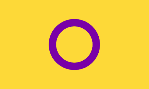
This here is the intersex flag. The numbers on wikipedia suggest there’s somewhere between .5% and 1.5% of the population that are intersex, which I need to remind you, means that there are about three hundred and fifty million of them at the bottom end estimate, and if America gets a flag with that kind of head count, so do intersex folks.
This design avoids the conventional gender association colours we have; no blues, no pinks. They’re also clearly and starkly contrasting, too, which is important, so they don’t get muddy. The design is incredibly replicable – a purple circle in a yellow field – and also invokes the gender symbols (both built around circles) that it then explicitly doesn’t use.
Great stuff.
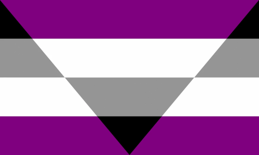
I promise this isn’t me just going ‘here’s the pride flags I know, you’ve probably never heard of them.’ This is the autochorissexual flag, a form of asexuality where there is still an interest in the experience of sexual media, but a disinterest in participating in sexual activity. If you’re one of those people who thinks they’re ace, but still love downloading and reading dirty fanfic, check out the term ‘autochorissexual,’ you may find resources that are useful for you to know about.
Anyway, this flag rules. It uses the palette of the ace flag (which is great), so it connects itself to the same type, but it doesn’t present itself as the horizontal-bars style of look, with this triangular inversion. The shapes are overlapping, and you can get the form of how this flag needs to be coloured by folding the paper along edges and lines. This is really cool!

Still, you can’t beat a classic.
The trans flag is a field of pale blue, with a stripe of pale pink overlaid, and a smaller stripe of white overlaid. You can make this flag with three lines laid over the top of one another. You can arrange any number of objects in this construction easily to invoke the flag. The colours are iconic to this flag – other flags only use them when they’re invoking this one.
The flag uses blue and pink to represent common gender transitions, but it also includes a strip of white in the centre, to represent those people who are completely unrelated to either. The trans flag has binary and nonbinary trans folk included in it, which is cool to do when you have so few ‘meaning units’ you can put on a flag. Consider how many flags we’ve looked at that suuuck that use words and seals and symbol shapes to try and convey what they’re about and how bad a job they do compared to this.
The trans flag is, in my opinion, the best pride flag. Now, is it a perfectly inclusive flag? No, not at all – it uses pink and blue to symbolise common gender signifiers we use of masc and femme, and there are lots of trans folk who find those gender boxes as inherently a problem. They’re not wrong. The flag isn’t perfect, and it might never be able to be perfect as long as it’s a byproduct of this, of our culture.
There is one final note about this though! It’s my favourite thing about this flag, too. This flag is symmetrical, vertically, which most of these other flags aren’t (most, hi intersex flag). That means that when you fly this flag, no matter what direction you anchor it, you didn’t get it wrong. The flag is always going to be correct. The reason for this, according to Monica Helms, the creator of the flag, is explicitly because there’s no way to be trans wrong.