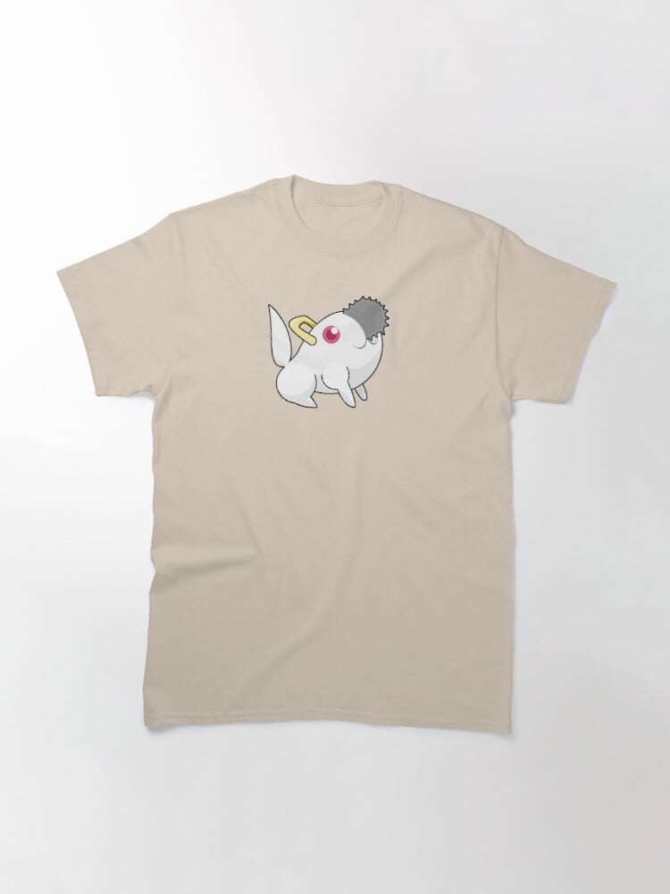
T-Shirt: Hazbin The Hotel
Hey, turns out that new cartoon for cool youths is something I really like. But I couldn’t just draw fanart of sometihng, no, that would be too sensible and good, noooo, so instead I decided that what it really needed was a reference to a 35 year old videogame logo from a time when that game was not yet a punchline.

I am so happy with how this looks? It’s simple and crisp and I really like how Vaggie looks with her happy smile at Charlie like ‘oh, that’s my idiot.’ If you want it on something, you can get it on a sticker, or coasters, or a t-shirt, or, you know, normal Redbubble stuff.
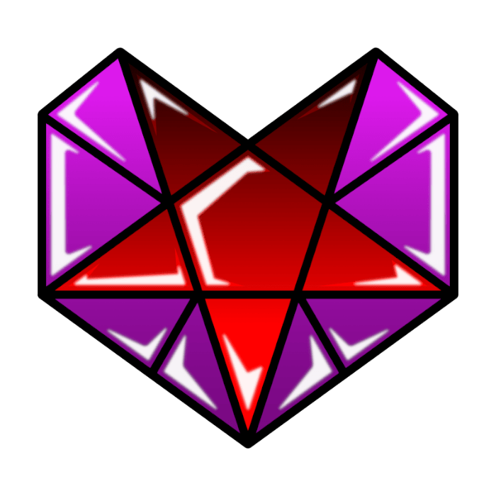
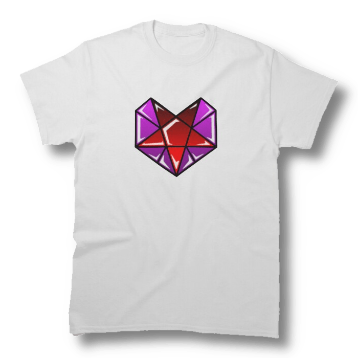
T-Shirt: Stained Heart
Here’s the design!
Here it is on a shirt!
T-Shirt: Reading Ralts
This one might not be around for long. Consider it a ‘limited run’ design. Typically speaking, anything that’s too obvious and related to Pokemon, even if you draw the art yourself, gets bumped off the Redbuble store, eventually.
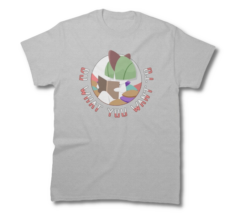
Point is, I drew artwork, back in 2023, of a Ralts having a chill time reading a book, with a message I personally think of as inspiring, and put them on a shirt. This design was made for someone in particular, inspired by them, but I don’t want you to be deprived of it. I have my copy now, so I don’t need to worry about it being, like, taken down too much…
But you might want a copy of it.
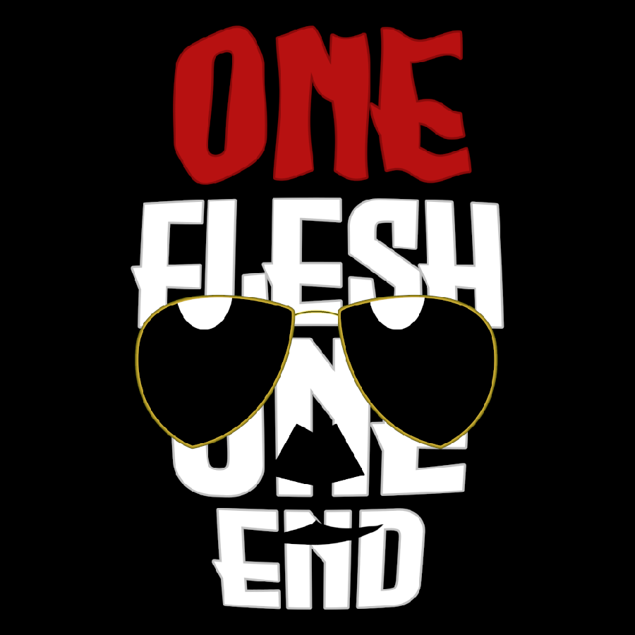
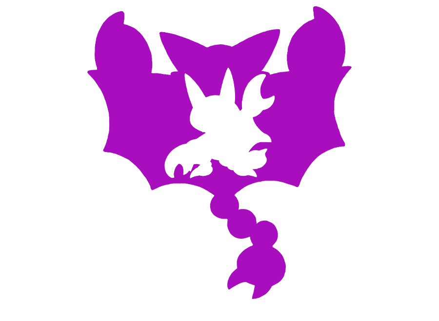
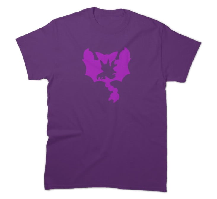
T-Shirt: One Flesh One End
I didn’t start this year expecting to be profoundly affected by The Locked Tomb books. As I write this, I have only finished three of them BECAUSE THE FOURTH ONE ISN’T OUT YET, but sometimes, a design haunts the brain and wants to get out. Hey then, here’s a fanart design that I hope doesn’t violate a fanart policy.
And here it is being worn by a digitally stitched-on model
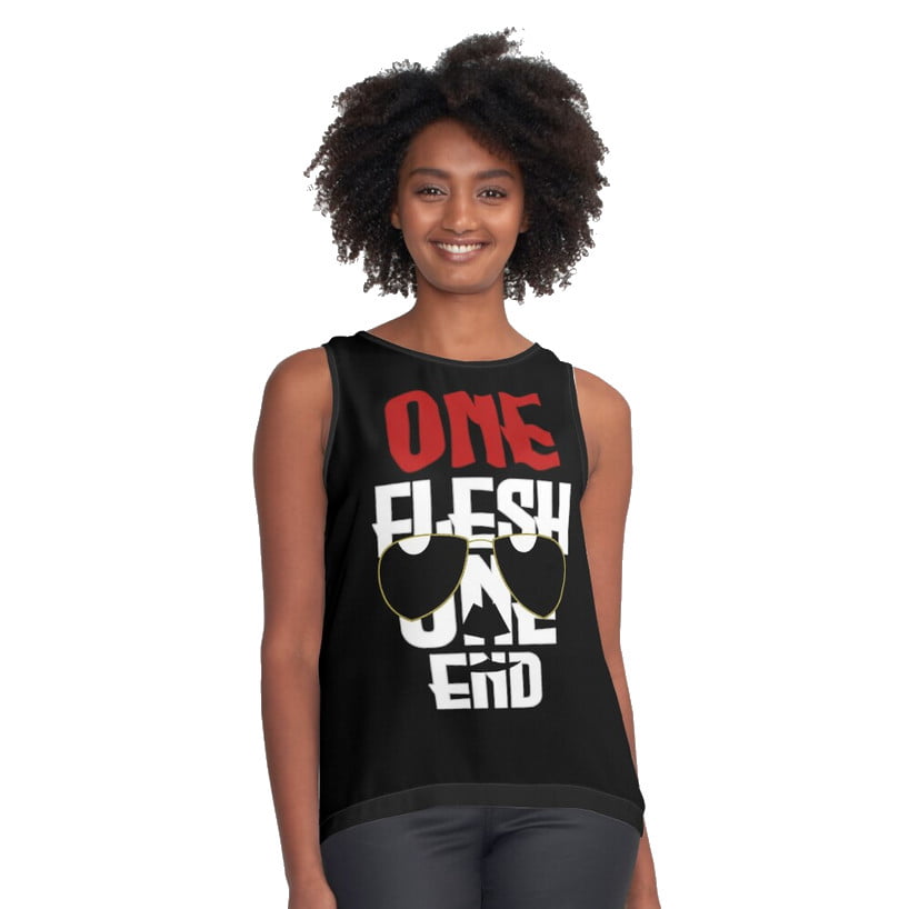
If you want to see this design on things, you can get it here! I would personally recommend, if you are in some way a giant jacked gay lady, that you should get a version of this shirt without sleeves, as it would make Gideon Nav proud (I think).
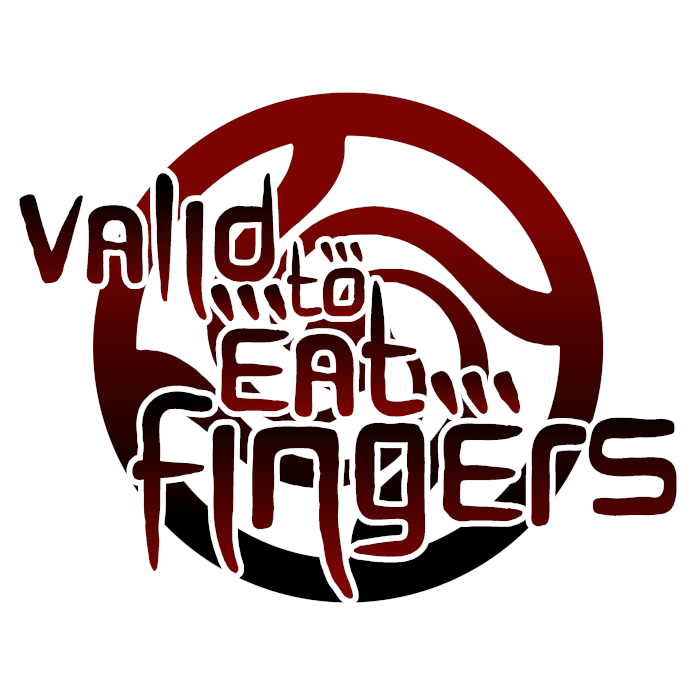
T-Shirt: Valid To Eat Fingers Jujutsu Kaisen Shirt
I like the anime Jujutsu Kaisen. I like odd memes that make sense mostly if you’ve boiled your brain in Tumblr long enough that the conversation has cooked away and left nothing but meaning-chunks behind. Together, that resulted in this design:
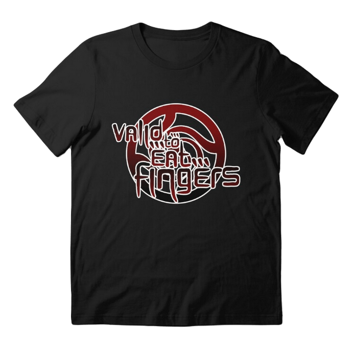
And here it is, on a shirt!
This design has enough permutations that I thought it best to make a whole collection of them. You can have them in solid black, solid white, transparent lines, black text and white background, and of course, the gradient version I favour. They’re also on masks if you’re particularly weird about people being near your mouth!
Shirt 23.09 — Cui Bono Asked And Answered
If you’re not familiar with it, Cui Bono is a Latin aphorism that has become something of a loanphrase in English because there’s nothing quite like quoting an old dead dude to legitimise your complaint. It means ‘Who Benefits?’ and it’s used in conspiracy circles to encourage you to keep imagining more and more reasons for something to be the responsibility of those people. Thing is, almost always, the answer for ‘why would they do things this shitty way?’ is capitalism. And so:
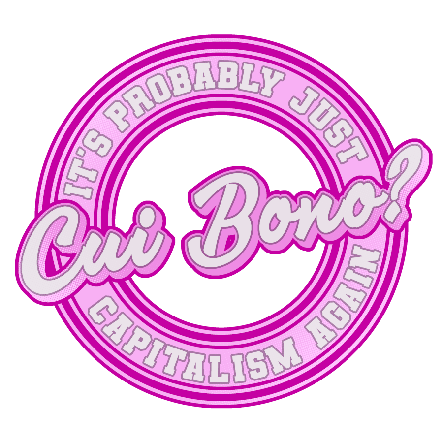
No small irony in that I made this design on the second of May, back when I was ruminating on whether or not I stick with Redbubble at all. Still looking for alternatives, so maybe this gets edited later.
You can get this design in one of four colours, green, blue, pink or tan.
T-Shirt: Support Your Local Things
I think at some point I just want to make sports logos of everything that isn’t really appropriate as a sports logo. Anyway, here’s a The Thing as if that’s a sports logo!
You can get this sticker or shirt design here! What’s more, because I made such a big file, it’s available to jam on a bunch of different designs I don’t normally get to use – like you can get a jigsaw of this reference to the 1982 movie The Thing. I don’t know why you would want it, but it’s an option!
I didn’t set up the microskirt option though that seemed… weird.
23.07 — Shinigami, But The Cool Ones
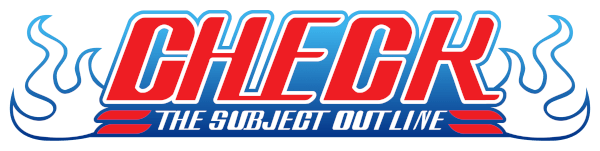
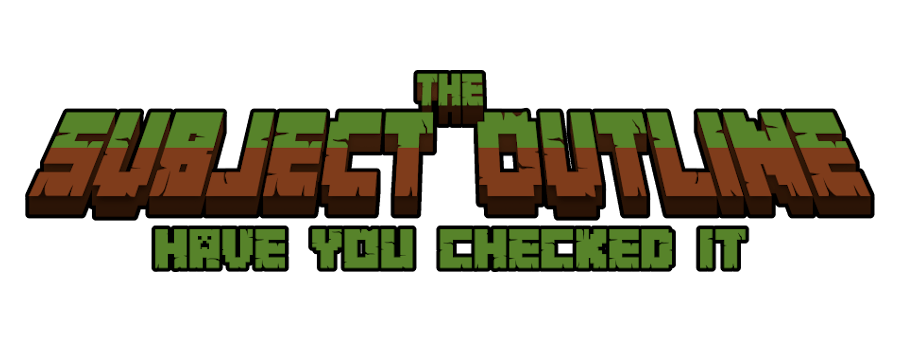
There’s a particular genre of shirts I design to wear in front of my students that give them the subtle messages that I am a huge nerd and also they should check the subject outline. I have one, a Naruto shirt, which is consistent at getting students’ attention, but here’s the thing.
I’ve not watched Naruto.
(Yet?)
When the Big Three came down, I didn’t wind up buying into Naruto. It didn’t connect to me, but Bleach, man, that series did. I think because I thought Rukia was cute and a boy. But point is, if I have a Naruto shirt, I owe it to myself, to my honest representaiton as a fan, to have a shirt that matches my own cringe, not just the cringe of others.
This design, which I do not imagine anyone but me wants, is available on my Redbubble store.
Shirt 23.05 — Haru-Ni ’06
Anime in my mind comes in strata. Different ages, different things that made significant changes to the landscape of anime. Things that feel contemporary weren’t, because I got to watch them at the same time. Things that were contemporary didn’t seem to be to me because I missed one. And in 2006, there were two different anime that shook my world launched – and I didn’t enjoy either of them until they were years old, unaware that the impact they had was nearly simultaneous.
The Melancholy of Haruhi Suzumiya, a really great series that I should write about sometime, and Ouran High School Host Club, an equally excellent anime that made a lot of millenials grapple with being gay or girls or gay girls, both hit in April 2006. They were important in ways it was hard to explain, and even now they’re both handy touchstones where you can point to them to just open conversations about anime of that time. They, in a way, ruled the world.
And they both had main characters named Haruhi.

Here, then, I present stickers for you to show which you support in their quest to take over the world of anime as of 2006. If you’d like them, you can get them, with Haruhi Suzumiya as the Presidential runner, or with Haruhi Fujioka as the Presidential runner.
Shirt 23.04 — Can’t Lose
I need very little encouragement to make some things. Over on my Patreon (where you can sign up for as little as a buck to give my brain good chemicals), I suggested this shirt design as a potential one for this month. One person went ‘I like it,’ and so I went and did it.
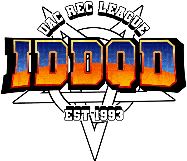
I was aiming at evoking a university sports team logo (which I looked at a lot of) and the DOOM logo from 1993 (which I also looked at a lot of, but for different reasons). This design involved learning a lot of things about how to make 3d-looking shaped text, which is how I got this eventual ‘curving’ effect — it involves the Lens Distortion tool in GIMP.
The popped text above and below the logo was made first in a vector program and then also made 3d in GIMP, too. Honestly, looking at this piece I’m pretty proud of how many pieces of this involved developing or refining a new skill to do something, or built on a skill I’ve gotten so used to I didn’t even conspicuously think of it.
I kinda want to get a hoodie or coffee mug with this on it for my dad but I think he, a preacher, might balk at the actual pentagram.
Anyway, you can get this design in black star or white star versions.
Shirt 23.03 – Sandy Hook Monday
When you engage in a work of satirical criticism, you need to approach it with a clarity of purpose that indicates to your audience the moral framework with which you do it, so that at no point it can be construed as uncritical support for the thing you are satirising, even moreso when contending with media designed to be consumed extremely quickly and uncritically. This is on my mind as I put a lot of work into how to draw a stupid cartoon of Alex Jones as a Garfield character, who absolutely sucks.

I made this design to be a sticker. Alex Jones makes a bunch of stuff in the form of stickers, things you can place around the world to direct attention towards his shitty advertising stream. Alex Jones, let me be clear, is an abusive cult leader who is trying to exploit en masse a community that he also never wants to interact with. Right now, he’s clocking on with a tediousness that speaks of the ‘hilarious’ office garfield strips about hating mondays, and that was the genesis of this design. He sucks, and he’s banal, and the things about him that suck are also pathetic.
This design didn’t feature the background at first. The ‘Hate mon days’ logo used to be ‘HATE ‘MON DAYS,’ as in ‘hate them on days.’ There didn’t used to be as many stackies of paper, nor the big Sandy Hook bill. But I had to add to it to try and make sure it didn’t just look like I was at best neutral about how much this guy sucks.
I’m proud of it, I think it looks unmistakably like Alex Jones if you’re familiar with him, and if you want, you can have it as a sticker, a pin, a shirt, a hat, a coffee mug, or even a magnet!
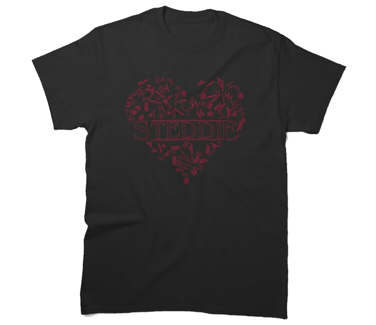
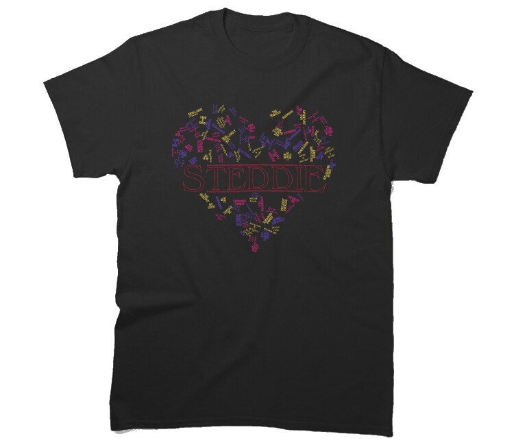
Shirt 23.02 – Steddie Things Shirt
First up, the design! On a shirt!
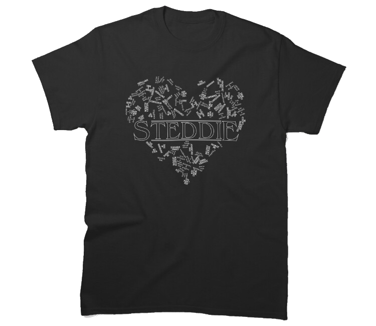
Second, the design on its own so you can look at it!
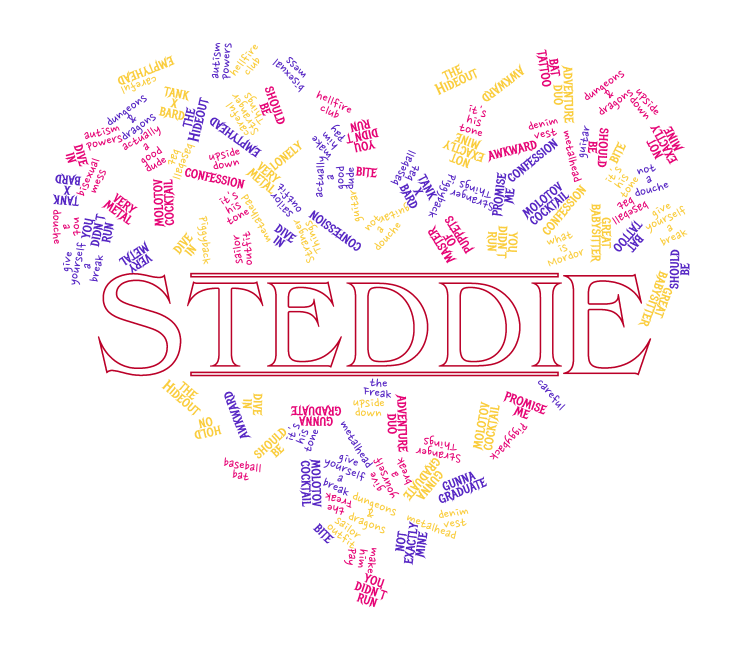
This design is something of a proof of concept. At first, the idea was that this was an idea I could port to a lot of different sets, where an identifying Ship Term (in this case ‘Steddie’, but I also considered Soriku) is surrounded by a love heart of phrases that are meant to relate to experiencing these characters in their lore space. And this is a design type I want to make more of (now I have this first one done), but at the moment, this design took a long enough time to make that my ambition to make a bunch of these ran into a wall.
The thing that may surprise you is how hard this list of text to add to this turned out to make. To make this kind of word clouding work well, I need a big variety of textwith different weights, and I had to construct this cloud myself. That meant that I also had to make the title in the middle the way I chose to. If I needed 300+ words with different appearances and weight, I was able to get to a whopping fifty.
I like this design! I like how much better I can make the next one, too.
If you want this design, it comes in three flavours, the mixed colour version, the pure red version, and a pure white version.
Shirt 23.01 – I’m Fine, And You?
First up, the design on a shirt.

Second, the design in a png so you can read it.

And third, the raw text of the shirt so you can read it even more clearly:
The text ‘I’m fine, and you’ interrupting a litany of text in the background struck through that reads:
In late November 2022, a misprinted label on a pair of bootlegged boots introduced the world to the name and credits for GONCHAROV, a ‘greatest Mafia movie ever made’ which then caught on for what was roughly one long weekend of Tumblr engaging in an extensive game of ‘yes and’ that involved improvising screencaps, scene summaries, movie posters, and a truly impressive amount of sapphic fanfiction that was derided then by non-tumblr users as ‘just tumblr’ even as the joke spread all the way to Martin Scorsese, its supposed director himself.
If you’d like this design you can check it out in black or white text!
T-Shirt: Inspiring Threat
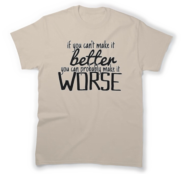
Hey, you know those ‘live laugh love’ and ‘in this house we do hugs’ kind of inspirational posts? Those things have this weird threatening energy to them. I’m often struck by how the aesthetic of them deforms the message, where how they become unsettling just by the way they are composed and all it takes is the right mix of unimpressively hacky fonts to take a message with some meaning and make it demand scrutiny.
Anyway, a long time ago I heard at a draft table, you can’t make it go faster but you can make it go slower, you know, as a way to scold players who were trying to rush other players making decisions. Somewhat recently, I rewrote it, a permutation of it:
I’ve been thinking about this phrase a lot in the context of, uh… well
You look at twitter over there?
It’s a phrase I like the more I turn it over, because it’s both an impetus to be kind (think about the ways your impetus to act may cause harm) and also direction to recognise that some things are damaged beyond salvaging (and maybe you should be spending your energy tearing down bad things).
Anyway, uhhh, you can probably get masks, shirts, and stickers before Christmas, if that’s a thing you want?
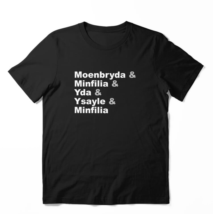
T-Shirt: List Jokes
It’s November, we’re all tired, have some shirt designs I dreamt up while I was doing the shopping and picking through cauliflower
Here’s a joke about how Final Fantasy 14 kills off cool women characters for no good reason. Here’s a version with white text, and one with black text!
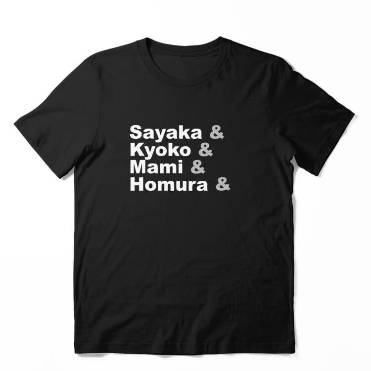
Here’s a joke about Puella Magi Madoka Magica. Here’s a version with white text, and one with black text!

Here’s a joke about how we must sound to people outside of the fandom! Here’s a version with white text, and one with black text!
Mask: Rayearth Masks!
It’s another set of masks, which were originally made just as a test of the question ‘can I make these elements line up?’ This time I’m aiming at trying to evoke the lovely armour designs from classic 90s magical girl isekai anime, Magic Knights Rayearth, with designs in red,

Blue, and
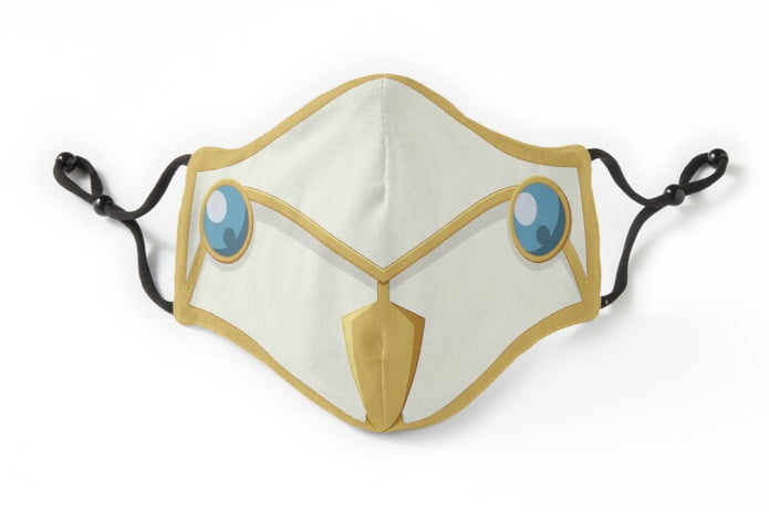
green. I promise you this is meant to be green.

You can get these designs (red, blue, green) over on Redbubble.
Shirt: Friend Of Blåhaj
Hey, it’s Pride month, and so I needed to make sure I really made some fun queer-friendly design, right?
Well:
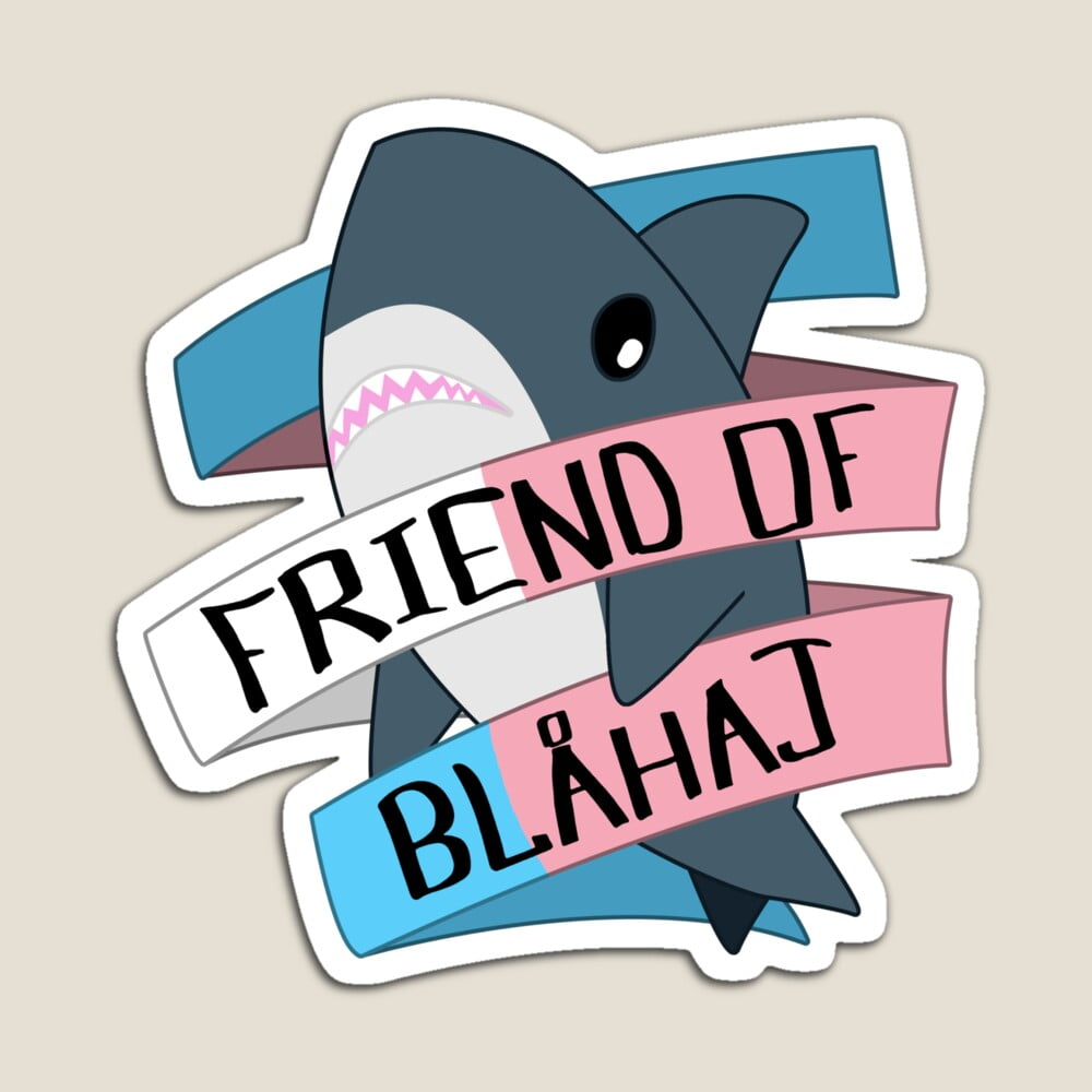
I made a cute design of a shark with a banner on it!
There’s a collection of them – with different banners and backgrounds – but I’m trying to not overload myself with dozens of designs for every possible flag or application. It’s available as a sticker, badge, mask and cap design if you don’t want to spend T-Shirt money (or if t-shirts are weird and expensive for you, or just generally not set up well for your body).
If you want this design with another banner like ace or agender or something please let me know so I can set that up but I am defaulting to just these two because they’re the most convenient for me to make and setting up two versions of every possible flag represents a huge time offering.
Shirt: The Idyllshire Copycoeurl
You know now I’m open about playing Final Fantasy XIV there’s a whole bunch of specific niche jokes I can make that don’t make me feel like I’m divulging the location of a covert operative.
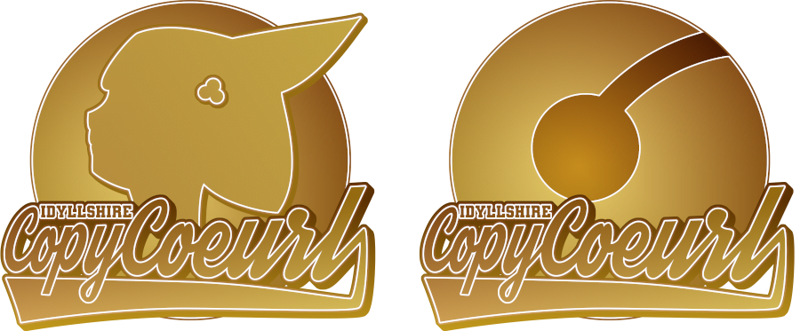
These two designs, the Profile and Bell designs, are available on Redbubble. I recommend a baseball 3/4 style, for that proper ‘sports teams supports’ design.
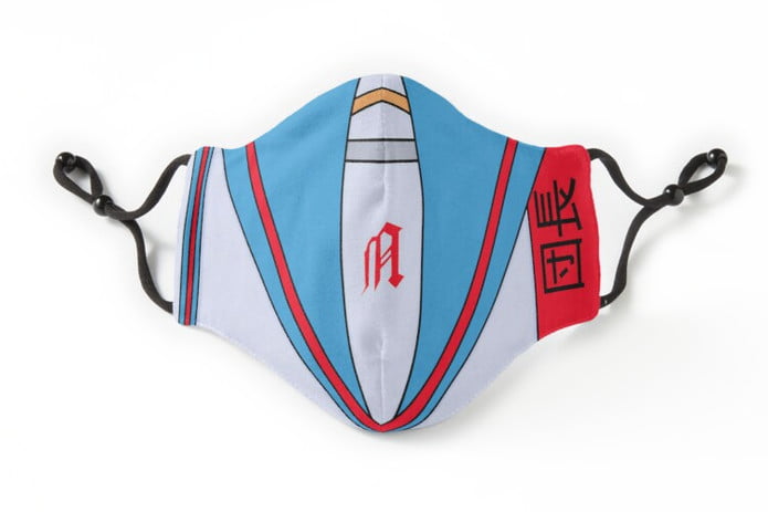
Mask: Some Masks!
I don’t need shirts right now. I do however, want to have some masks, so I can wash them very regularly. Let’s check some out!
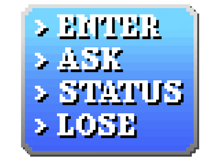
I love my THIS SHIRT SAYS TRANS RIGHTS shirt, and I wanted a version I could wear on a mask when I need my shirt real estate to say something else, like, say, DID YOU CHECK THE SUBJECT OUTLINE. I made this variant on the shirt for mask purposes.
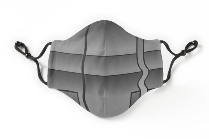
I have a M*A*S*K mask already, but I was never as into MASK as I was into Transformers. This mask is based on the face of Wheeljack, from Transformers.
And this is my masterpiece. This Haruhi-inspired asymmetrical mask is a reminder to me just how much I love that classic anime. I should write about it later this year.
Sticker: Tama Go-Ju!
This joke is far too niche, but if you (‘ju’) are an egg (‘tamago’) who had a realisation reading Ranma 1/2, then I have made a sticker for you. Just you.
Here’s the design:
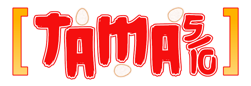
And here’s how it looks on a hat:
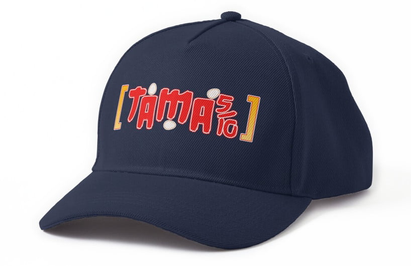
I don’t think of Smooch Month as ‘Ranma month’ but this is the inspiration that struck and this is the result. Enjoy this eggy joke that I won’t wear myself. I made something for you! And the cheapest way for you to get it is to buy stickers, over on Redbubble!
Inquagnito Mode!
You know how I wrote about how there was a chance that cool design I had of a Quagsire sneaking around in a mask wouldn’t ever be able to be published because discoverability was functionally broken?
Well turns out I lied.
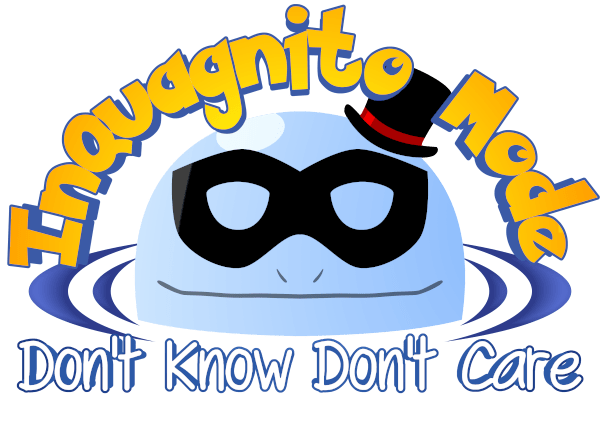
Here’s this month’s design. I recommend getting it on a sticker (cheap) or a hat (pricey), but as always, you can get it on a shirt.
T-Shirt? Some New Year Masks
In my current understanding, kids will need masks in the new year. Masks are also a good thing to have in your life as something you can wear for when you’re feeling generally low-key ill, like if you have a cold, wear a mask to keep from spreading it, that kinda thing.
I made my own mask this year based on a dumb joke, and then realised wait no, this whips and I’m going to keep using it when I’m out in public in general, because it’s not bad to be careful. Here, then, for your new year purchasing purposes, are three masks I made for me or for family members.
I’ve been wearing these masks from redbubble for about six months. I find the adjustable straps nice and comfortable, but also nice and durable: I’ve had other masks snap over time dealing with my big weird head.
My first mask, modelled on Matt Trakker from all-purpose advertising yawnfest, M*A*S*K:
This should not be seen as an endorsement of M*A*S*K and more just me signalling to a general audience that I am old.
One of my niblings still needs to wear a mask to school, a fact that has him bummed out. So I asked him what kind of masks he’d like to have – and this is my attempt at a g-rated version of Scorpion’s mask from Mortal Kombat. Like I don’t think a teacher is going to get mad at anyone for this, there’s no blood spattering.
And finally we have a mask that represents the passive okayness that you can only get out of a Snorlax.
I don’t know if you order one of these masks now you’ll be able to get them in time for Christmas. But I do know that you should have them in time for the new year and the subsequent new school term, which you may need or want if you have a kid in your life who is bummed about needing a mask but might be a bit perked up by the mask seeming, like, kinda cool. Maybe. Maybe they think this is cool? Hell, I don’t know what the kids think is cool.
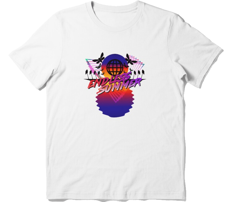
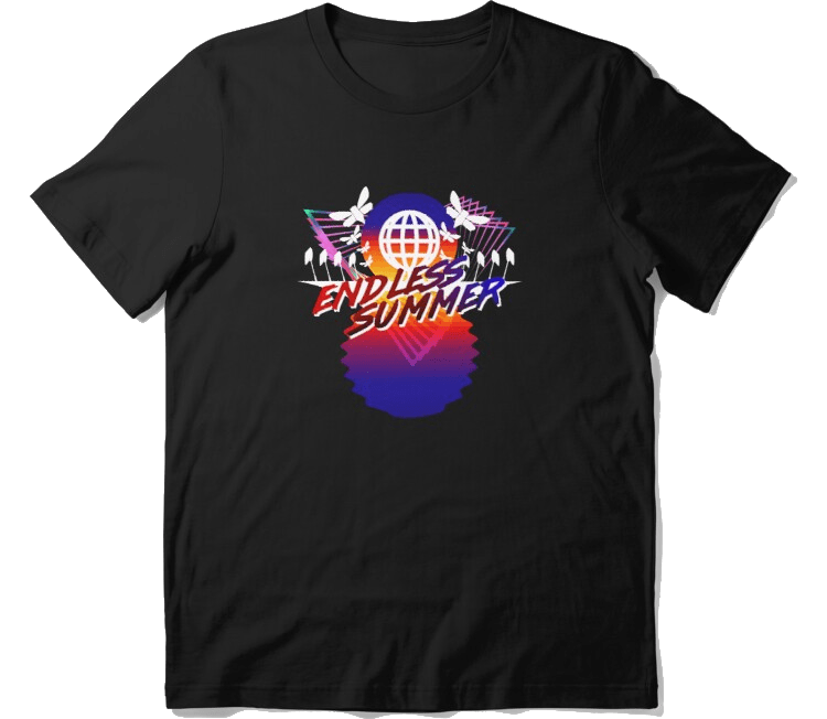
T-Shirt: Endless Summer 2021!
It is, here where I am, the last days of spring. Summer is coming, or, really, as an Australian, summer is now. Some people like to imagine seasons as these simple, standardised, three-month chunks, but here in Australia, Summer kinda reaches from sometime in October all the way through to April, if it’s a hot one. Every single day of summer, it seems, shows up with a phenomenal force, a demand that you contend with it.
It’s also the time that my university work isn’t available, creating a strange period where I have something like three months of holidays, a long, slow stretch of time to write, read, create, and yes, of course, contend with the heat.
It’s the first time in my life I really connect with this idea that Americans espouse, of the idea of ‘summer vacation.’ And so I made this shirt, a testament to the way summer feels.
I like to think that sometimes my shirt designs are about jabbing out a simple, short joke, sometimes about using a simple tool well. This one is one I took a lot of time on; multiple iterations through the months, multiple additions of elements. Every element of this design has been made or remade at least twice, because I wanted to make something that looked really good to what I wanted to.
Since it has black shapes in it that rest against the colour of the shirt, there are two designs; one for putting on white shirts:
And one that’s for putting on black or dark shirts.
You can get either design (White or Black) over on Redbubble.
T-Shirt: A Good Good Boy (Being Impersonated By A Very Bad One)
I read Chainsaw Man in a day. It’s really good! I liked it a lot! Not something I can recommend to most people, but still, I thought it had some really cool ideas, great utilisation of the entirely 2d medium, wonderful characters, and, of course, it had Pochita, a good, good boy.
And being me, I immediately compared Pochita (a contract-making animal mascot with enormous destructive potential) with Kyubey, from Puella Madoka Magic: The Latest Movie (a contract-making animal mascot with enormous destructive potential). Kyubey is exactly the kind of garbage who would look at the kind of contract Pochita got and say ‘well, if that’s what it takes to get that kind of power, I’m down.’
I made these using the pen tool in GIMP. That’s why everything is these smooth shapes, and largely things are intersected. I thought about putting both designs on a shirt facing each other like this, but the thing is, that would require me to go through the lighting on both of them?
I dunno, maybe if someone better than me at lighting told me a way to do it easier, I’d make a shirt or sticker of them looking at each other.
There are two designs; one that’s just very clean, simplified fanart of Pochita:
And one that’s about that impersonating asshole Kyubey:
I really like that this artwork of Kyubey involves a lot of substitution but doesn’t need to change much. Kyubey’s gold rings used here to represent the handle and his eyes are also extremely distinctive.
Personally, I might not have a Kyubey shirt, but I might get a badge.
You can get either design (Pochita or Kyubey) over on Redbubble.
T-shirt: Menu Loss
I have a bunch of t-shirt designs that build on the meme of Loss. I think some of them aren’t so great, as shirts, any more, and are a little slack or lazy in their execution. Since I wear them to class, I decided I needed to update and add to those designs, so here’s another one.
Here’s the design, on a shirt:

You can get it on Redbubble.
T-Shirt Megapost: Subject Outlines 2
Yesterday I started on showing off this month’s t-shirt designs, and boy there are a few this month. I would normally put t-shirt designs at the end of the month, but in this case, I’m actually getting these shirts in time to wear them for this semester… which is also the same time any of my peers might want to see them.
Sonic The Hedgehog logos are really quite good. It’s a standardised font, it’s a standardised formatting, and the rest of the logo is done with individual specific details for the media in question, like Mania’s springs and whorls. This was really, really easy to make and it looks great.
I think sometimes it’s easy to fail to appreciate just how good the branding is for Sonic.
Also, there’s a version of this with ‘& Knuckles’ on it, but it honestly doesn’t look as good and means the joke ends on a second punchline, and that sucks.
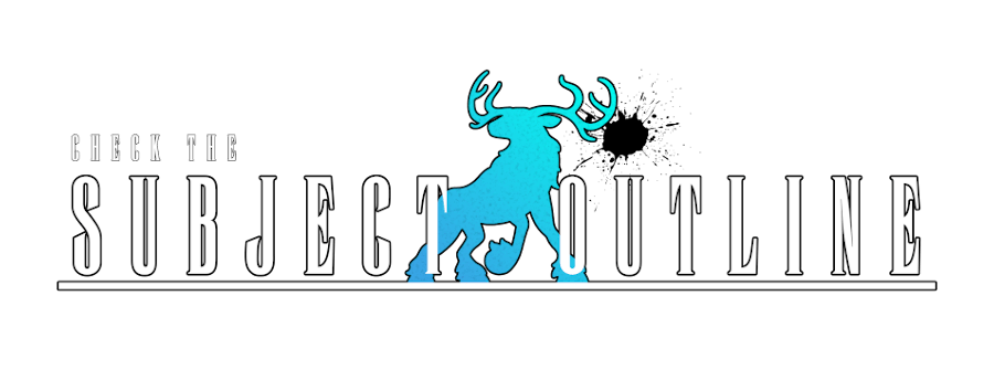
This was based on the suggestion of my dear friend Shelf, who pointed out that while yes, it looked like a Final Fantasy logo to start with, I needed something crystalline in the middle. Fox also pointed out that it’s where a splash of colour happens. In this case, it’s a silhouette of an elk.
Because elks are cool.
The elk is a gradient that then got ran through a cubism filter to make it look kinda crystall-y.
Speaking of that cubism filter, get a load of that crystal in my extremely home-made leadership matrix. The matrix is entirely out of gradients otherwise.
The text is really interesting because my memory of the gradient on this is really vibrant – a really rich red, a really deep blue. But if you go back and look at the G1 logo for Transformers, it’s… positively understated.
This gradient is made up, in order from the top of the image to the bottom, a gradient of blue-to-white; a line of garbage hand-drawn then smoothed and smudged to look a bit more like a mountain range; a gradient of red to white. The bottom of the garbage line gets blurred into the red-white gradient, and that’s how I got that effect.
I’m really proud of all these things that don’t require me to like, do much drawing vs making my designs with shapes, rotations and symmetries. There’s a lot of that here.
And finally…
God damn.
I wanted to make a shirt with the design from the Vaporwave Designer meme program. But the thing is, that’s not only not at a proper resolution for shirts, but it’s also really busy for a design when I can’t control all the elements of the shirt. I can’t cover the entirety of the shirt, to give it the proper background. I can’t do gradients either – less-than-full opacity, when printed on a shirt, is printed on white and creates a nasty white silhouette.
With those limits, instead of duplicating that style, I wanted to make something that evoked it, in colours I like. And thus, we get this hodge-podge of ‘wow, look at all the effects I can do.’
If you’d like to check these shirts out, maybe buy a sticker or a shirt… well, check it out here.
T-Shirt Megapost: Subject Outlines 1
ha ha ha or maybe we’ll have another lockdown after I write this post and the next one and these shirts will instead not get worn at class but oh fuck it here it is anyway
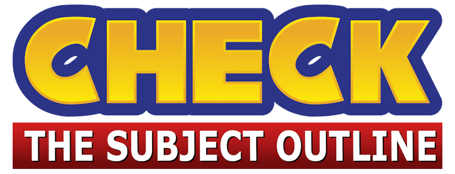
I like wearing my shirts to class. You maybe have seen my bumper collection of Loss shirts that I wear to teach a class about memes. One shirt that got a yell of laughter last semester was my ‘Have You Read The Subject Outline’ shirts.
Well, as this post goes up, I’m going to be teaching again this semester, and I made a bunch of other shirts of that joke so I have a full matching set for the semester. Here, then, are the first half of them, with some notes about how I made them.
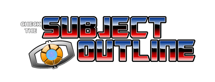
The actual phrase Have You Checked The Subject Outline scans to the Teenage Mutant Ninja Turtles cadence. Thanks to one Glench, a tool exists on the internet for building a framework for that kind of design.
In this case, the output of the creator just gave me the angle/style of fonts, and then I went and recreated them myself once I had someone else doing math on the arc of the letters.
The Fullmetal Alchemist logo is composed of letters, with specific kerning and details, that I seem to have installed as part of a system package. To get this look, I pulled the spacing in tight for the body text to make sure that the two most similar words fit the same bounding box. Then, it was a matter of giving it a pair of outlines – which I noticed, a lot of things rely on outline-thicker-outline, which does look great.
This is mostly just sets of gradients; one gradient for the red body, another for the red outline, same for the greys and silvers.
Note that in this design because the original logo doesn’t have a hanging element (the foot of the J), I had to then restructure things a little; I couldn’t just make SUBJECT and OUTLINE separately, because otherwise the bottom edge of SUBJECT would overlay on the top edge of OUTLINE. In this case, I put the topmost layer (the inner body text) paired together, with SUBJECT on top; then under those two, the outlines, then under that, a grouping. Then I had to make space to make sure the outline on the J fit.
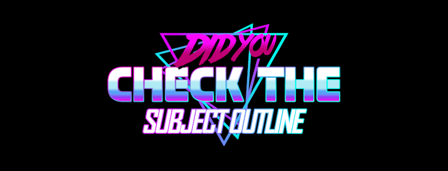
Design number three went through a lot of iterations. There’s a free font for minecraft, but to get the 3d effect I had to do a lot of struggling. First, create two layers of text, with a distressed/non-distressed font. Then I used a perspective tool to make it tilt backwards.
Once I had that, I took a copy of the bottom layer, the un-distressed one, and gave it a vertical motion blur a pretty big distance, then made a folder for the blurry one. I copied it a dozen times, merged those, and then made a copy and got rid of all the contrasty bits to make sure it was a ‘solid’ shape rather than a blurry one.
Then it was a matter of just trying out a lot if graphical effects to see if I could get a ‘dirt’ vibe without using textures I didn’t own and wasn’t allowed to use. I did toy with pixel blurring photos, but that got me inconsistant pixel sizes, and that was super annoying and looked a bit crap.
That’s half of these designs, we look at the next set tomorrow!
T-Shirt: Team Vaccine
As of when I write this, I am unvaccinated. Here in Australia, vaccination has happened on a schedule that we might conservatively call ‘a bit of a mess.’ Since February I’ve been aggressively checking the schedule to determine when I can get vaccinated, with an eye to being as soon as possible.
The category I belong to, according to our current government schedule, is ‘Balance Of Remainder,’ which is to say ‘everyone who isn’t old or a conservative politician.’ And so… time to cheer for the team.
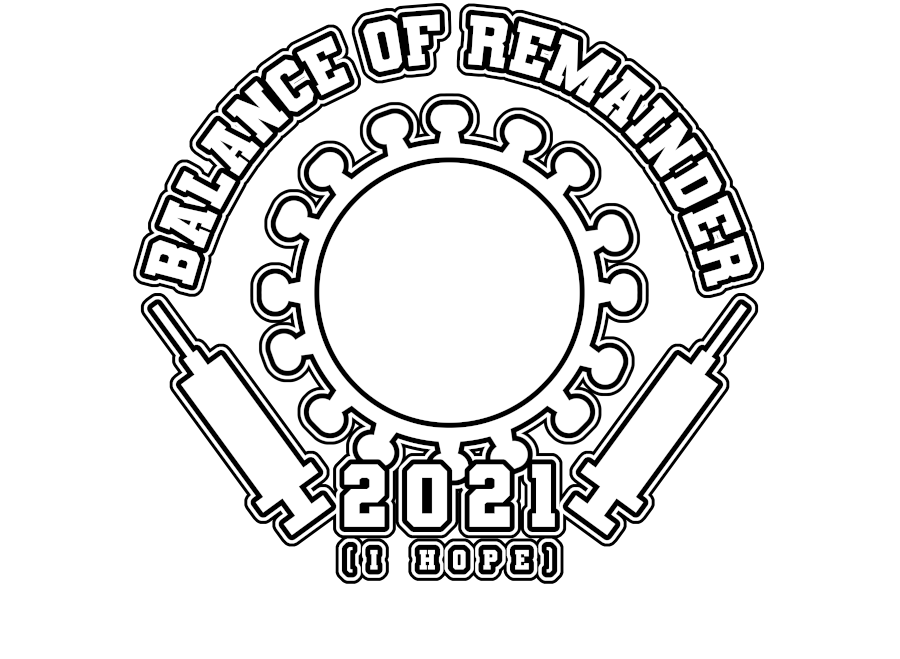
Here’s the design, on a shirt:
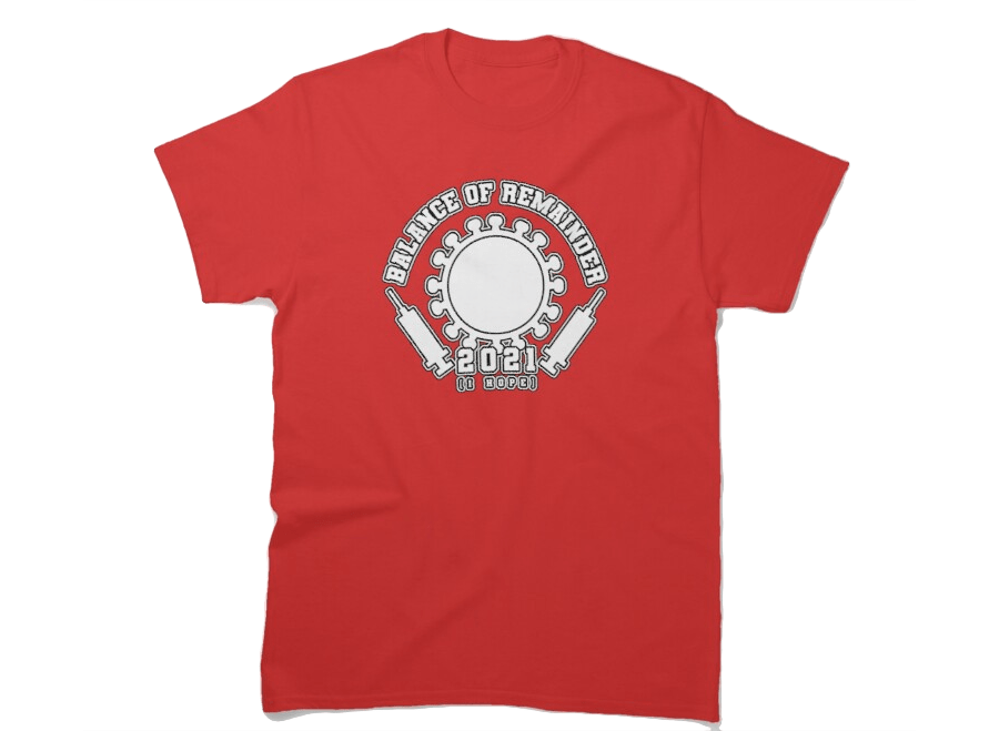
You can get it on Redbubble.
T-Shirt: HAPP PRIDE
This month, I wanted to do some pride themed shirts like last year, a shirt a week, but I just didn’t have a lot of inspiration for them, and, uh…
Look.
One of the things I like the most about pride is flags, because I am a huge dork. I don’t go to parades, and I’m a bi dude so Pride is also this common space where I get to watch myself get erased and forgotten and – like, lots of stuff in that space that kinda sucks. But flags, flags are cool!
I also liked my candy hearts design from earlier in the year, and I like the way they’re these like, badly printed, nearly-good representations of the things they’re representing. I like that a lot, and so I made this design that used my candy heart design and some flags I like.
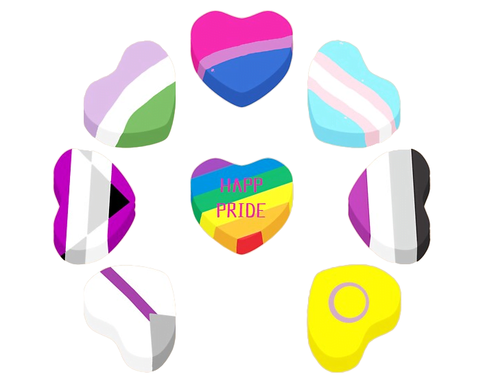
Here’s the design, on a shirt:
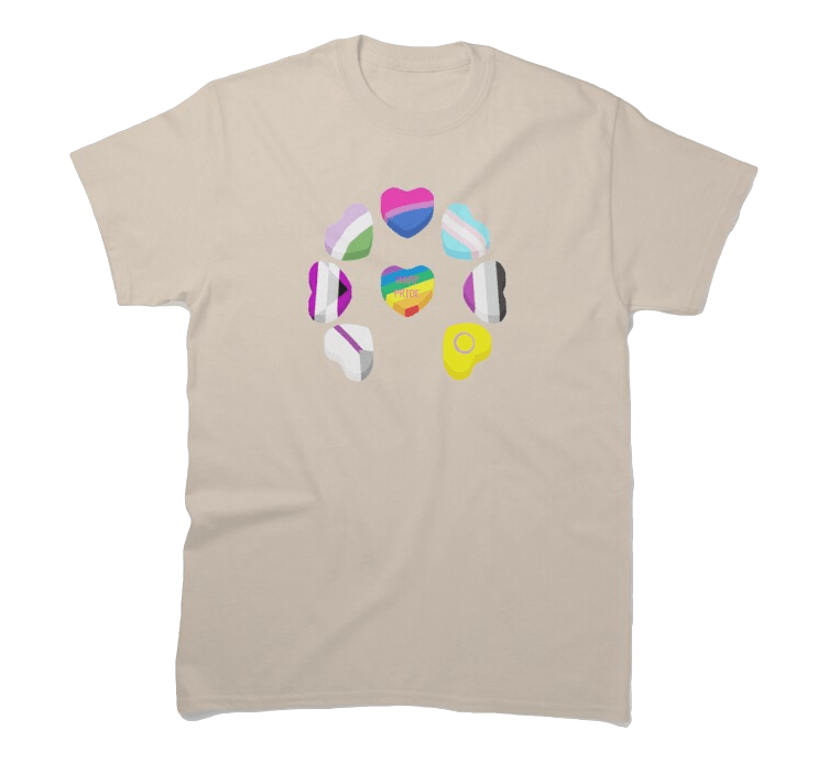
You can get it on Redbubble.
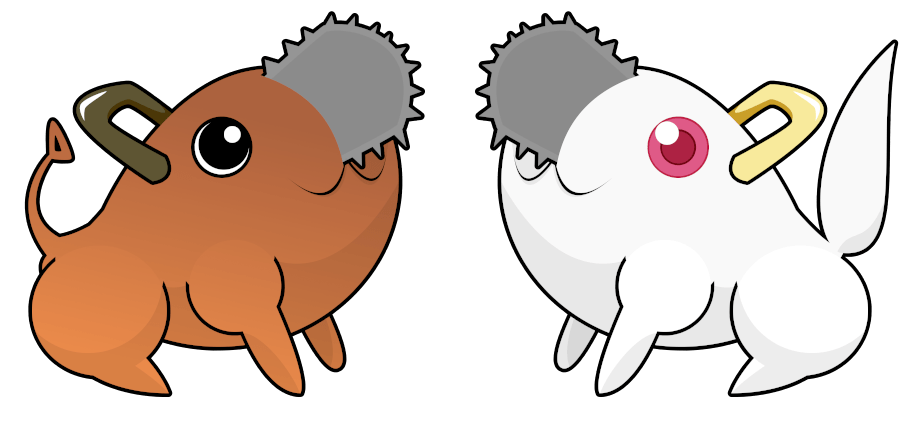
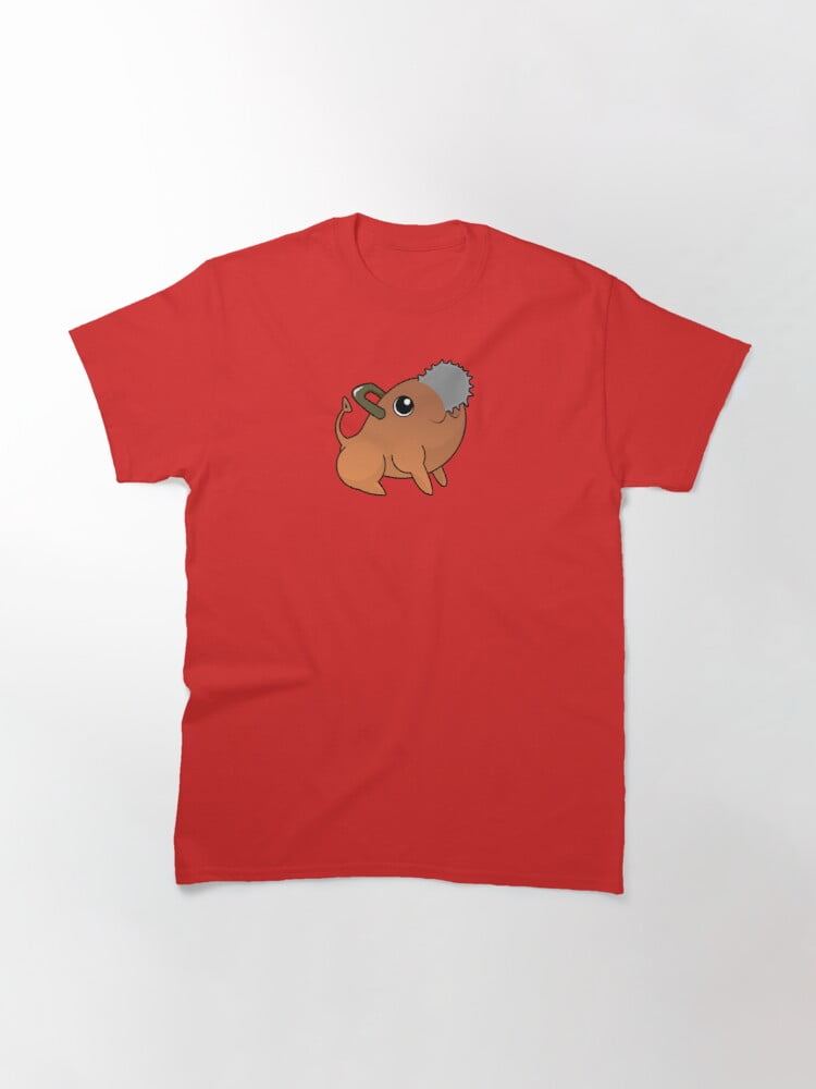
T-Shirt: Nondescript Flying Scorpion Creature
Who are my shirts for?
Like, that’s the question you ask with anything you make, if you think about it, enough. Who would want this, and being able to conceptualise your audience is a skill that I try and impart on my students. Who then, are these designs for?
On one level, what I’m doing is graphic design for sometimes as few as one or two people that might enjoy the joke. Sometimes I’m making shirts that I want to wear to class. Sometimes, I’m making shirts for people who aren’t me. For example, I don’t need a they/them pronoun shirt.
This shirt is a shirt that’s very much for me.
You’ve maybe seen this kind of shirt before. Normally, this design is focused on starter Pokemon – three form pokemon that get soooo much attention and merch.
And here’s a shirt of a Pokemon I’m very fond of – Gligar, and the silhouette of the Gliscor it one day will become and terrorise metagames that are afraid of a beastly physical wall.
Here’s the design, on a shirt:
You can get it on Redbubble.
T-shirt: Quiet Voice
I thought a lot about this month’s shirt.
I mean, it’s the me month right? Am I going to put a logo on a shirt that you can put out there that shows off like… me? That seems weird. Plus, my current setup is a little… let’s say it’s branding obtuse. Like, go on and ask me what ‘press dot exe’ means sometime, except Shelf, who knows.
Anyway, I thought at first about making some kind of logo for myself, then I did a few dumb deep-cut jokes about game logos and then I thought about making fan merch for a game that obviously a lot of people care about but which is completely unrecognisable to even other fans.
Also, it’s the Me Month. So I wanted it to be really easy.
I actually wound up making three designs today (today!). I also almost mad a fan-design for Carcer, based on a drawing a friend made of a spooky ghost. But that’s their art, not mine, and so that got scrapped. Maybe some of those other designs will come up later. The fine thing, the most important thing:
I really wanted this month’s shirt to be easy.
Like, if I was going to do something for myself, today, I think it’d be giving myself a break.
So I made something that gives me nostalgia and which I know will probably never sell a second copy.
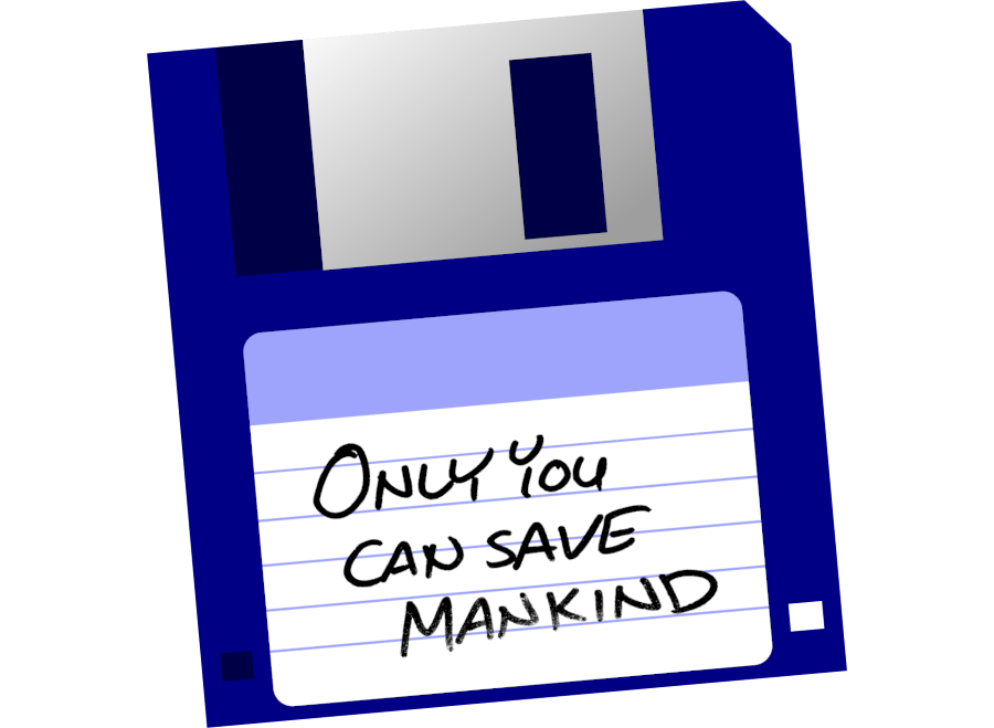
Here’s the design! It’s a 3.5 inch diskette and that is my handwriting. It’s meant to be like the disk that Johnny used to get the game in the book of the same name – complete with the fading text. It’s just a simple, small little thing, it wasn’t hard to make, and it reminds me of something that I care about a lot.
It also has a message that has more and more become part of my life. We’re the only people going to be saving us. It’s not coming from space and all.
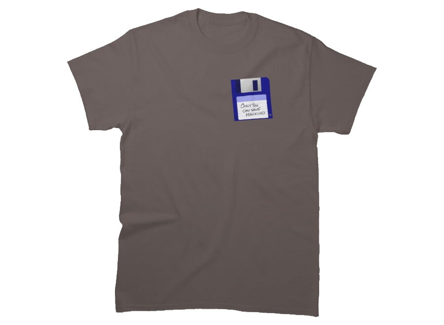
Here it is on a shirt.
You can get it over on Redbubble.